Dwell
Project Type: Web / Branding / UX Design
Unsolicited Website Redesign
Instruction: Sean Brodbeck
Institution: Tyler School of Art and Architecture, Temple University
Introduction
A large, complex platform for architecture and design
Dwell is a resource for designers, architects, and enthusiasts to share, discover, and appreciate inspiring design. Its online magazine highlights the stories behind architects and their work. Because of its broad scope, the website has complex information architecture. How could the online publication be reorganized and simplified while not straying too far from the original?
Simplifying the online experience
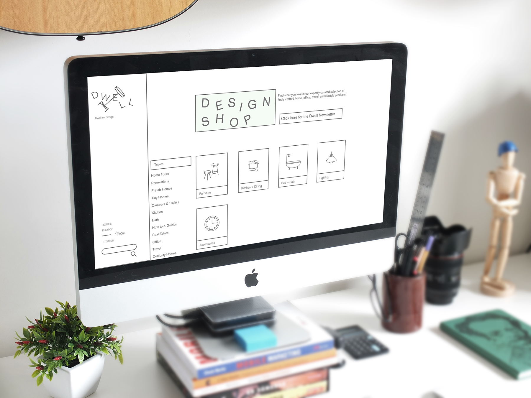
Dwell’s website is a resource for multiple outlets: online magazine, print magazine archive, online shop, photo gallery, real estate, and more. The broad umbrella of functions makes the website sitemap large. The website was simplified to create an easier-to-navigate experience.
Process
New Look, Same Great Resource
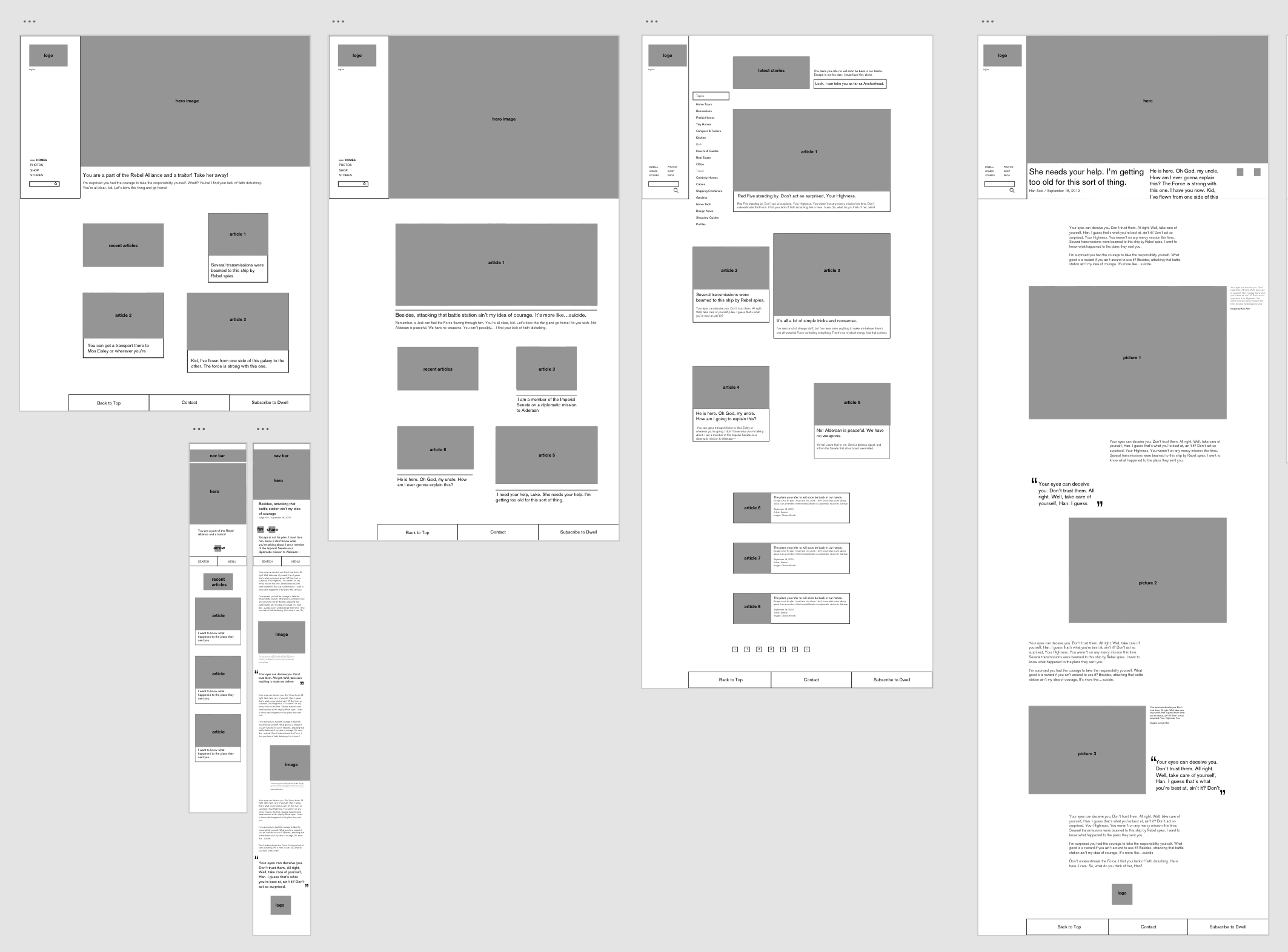
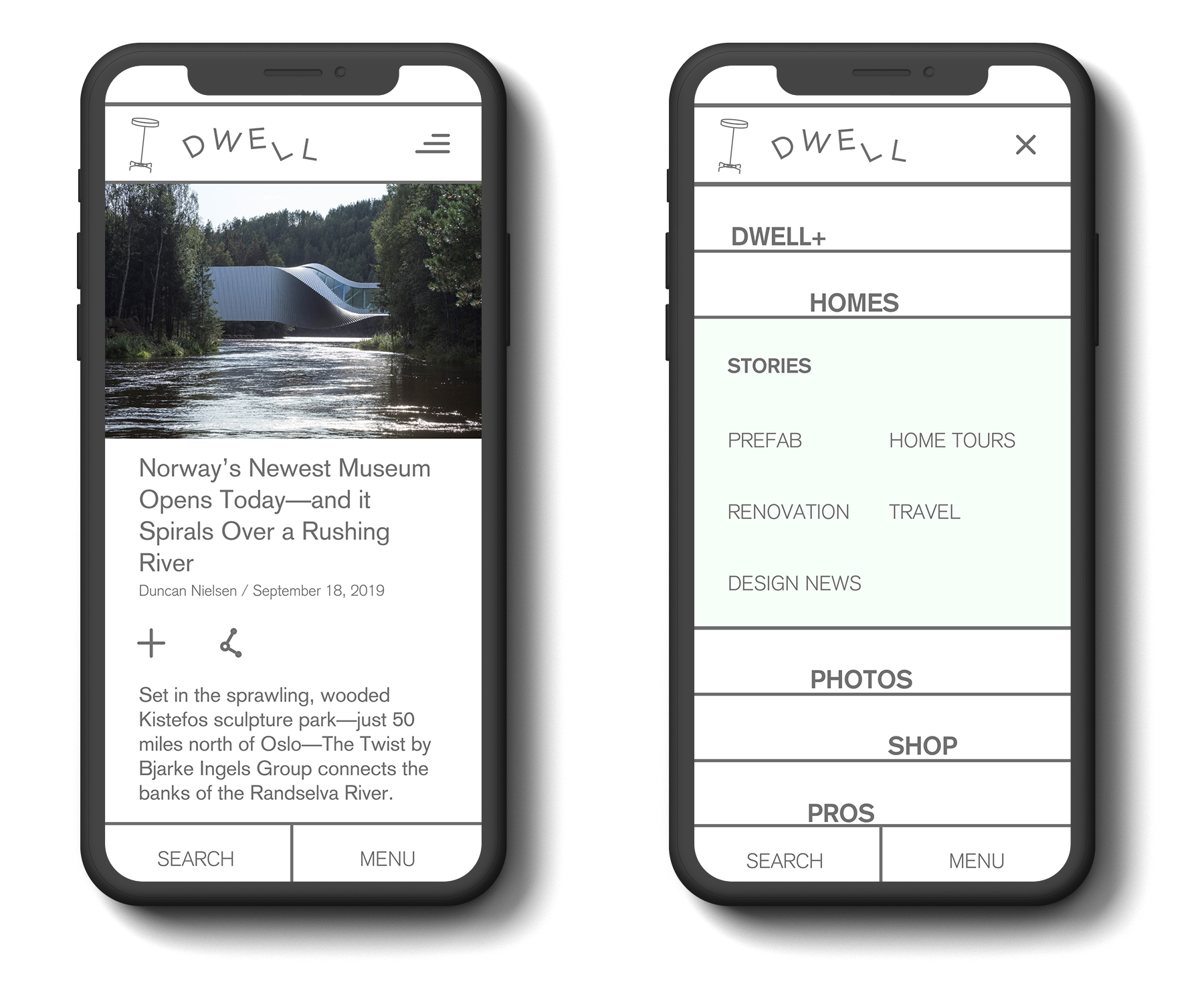
Reorganizing Dwell meant assessing its information architecture. The website had a very complex sitemap, making the page layout crowded. The redesign attempted to reduce the amount of choices presented to the user at once while still maintaining quick accessibility to anywhere on the site with a few clicks. This was in parallel in the rebrand process.
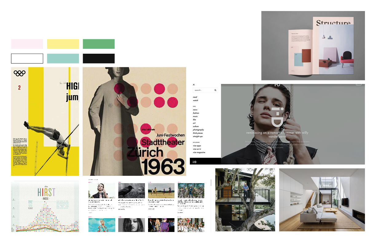
The rebrand process was meant to reflect the wide-open homes that Dwell puts the spotlight on. It still had to have the same clean, minimalist tone, so the rebrand effort focused on expanding that idea. Elements were given more space on a page. This would also allow the site to be more accessible to users who would feel overwhelmed with the original amount of content.


